
E-commerce businesses have witnessed exceptional growth ever since its big boost back in 2007. Several eCommerce experts and digital strategists claim that there are numerous strategies that make customers casually scrolling over the phone, randomly buying products online. One such strategy is CTA. Many of you newcomers in e-commerce might not know what CTA is. CTA is short-termed for Call To Action buttons.
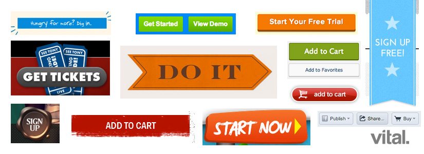
These buttons are an essential component of e-commerce websites as they play a pivotal role in converting website visitors into customers. CTA is a button with a link that prompts a visitor or a user to take an action specified in that ad or post. Some of the CTA buttons are Buy Now, Add to Cart, Sign Up or Learn More. Typically, CTA buttons generate a sense of urgency encouraging the users to take action in favour of the website or business. Here are some of the tips you must consider while creating Call to Action buttons for your e-commerce business.
Don’t Use Large Content Pieces
Using more content for your CTA button is always a bad call because it creates confusion in the audience’s mind that what exactly the website wants the user to do. Therefore, always keep your city buttons short and sweet. However, you need to identify your content in the marketing strategy and create CTA content as per the requirement. If your strategy requires you to maximise your content to 5 to 6 words, then you can go for it.
Colour Coordinate your CTAs with the Website Colour
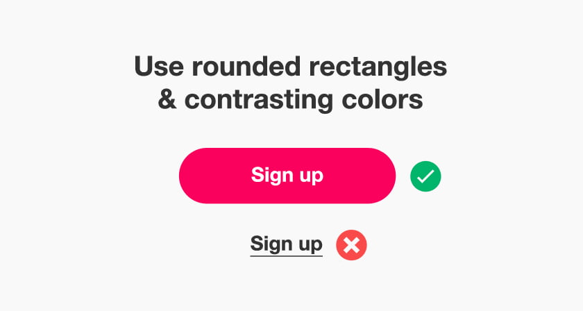
When it comes to shopping online, content and marketing are not the only aspects crucial in the customer conversion process. Something more important than these two factors is visual appeal, not of your product or your service, but the appeal of your website. Most websites choose one colour scheme in focus on different colours from that particular scheme to make their website visually appealing and aesthetic to the eyes of the audience.
Therefore, your call to action buttons must also be visually attractive and eye-catchy so that whenever your audience lands on your webpage, they are attracted by the button and are prompted to click on it. For example, if your website follows the colour scheme of black and golden using a completely different colour like green would not be a blunder. Instead, you must choose a golden colour for your CTA button, if your website has a black background. This will make your button and website visually attractive and will catch your audience’s attention in just a few seconds.
Keep CTAs relevant to your Content
Imagine you visit a website where you see a top-notch product. However, this ETA does not mention add to cart or by now instead mention learn more option even though the information is given on that page entirely. Wouldn’t it look suspicious to you? Not only this, but it will put a bad impact on your mind about the website detecting the lack of seriousness the business has. Never leave your CTA irrelevant to your marketing and ad content.
For instance, if UR excepting entries for your next workshop online and you are putting that information on your website, then the correct CTA will be; Book For the Session, Make Payment, Grab your Seat, Register Now, Learn More etc. Sometimes when a person visits your website, they are completely unaware of your business background since they are simply attracted by your ad or Google search. Therefore, it becomes even more important to clarify what you exactly offer and the CTA button is one such clarification to inform your audience about the action.
Also read: Content Techniques to Build a Better Platform
Place CTA on the Landing Page
A CTA is one of the most interactive ways for a website to communicate with customers. Since digital platforms, our customers come and put their trust in you, offering them a reliable and interactive solution is a must. Hence, CTA is one of the solutions to make your audience believe that your website is active and is willing to offer them trustable services.
Place CTAs on your landing pages depending upon your content and products on that page. The right strategy to identify the number of CTAs, you must involve in a single page of your website is based on how many products or services you are mentioning on one therefore try not to involve more than five cities, if you are not sharing multiple products on a single page.
Conclusion
Call-to-action buttons assist businesses to track and measure the performance of their website. Businesses are able to gain several insights by simply tracking the number of clicks on the CTA buttons. In addition, they receive insights on how the users are interacting with their website, and their activities along with an idea to identify the core errors and develop improvement strategies.
In conclusion, CTA buttons are extremely critical for e-commerce websites because they assist in improving the experience of your users, converting them into customers, and providing valuable insights into website performance, etc.